The Homebodies series explores the personal spaces of community members, the artworks and interesting objects they’ve collected through the years, and how those pieces live with them every day. This edition is brought to us by author, professor, visual artist, and Holland Project’s resident graveyard poet Jared Stanley. We absolutely love this little slice of Jared’s collection and his reflections on what makes these pieces so impactful. You can follow Jared’s personal work here.
1. It’s important to me to have lots of tones on the walls in my house.
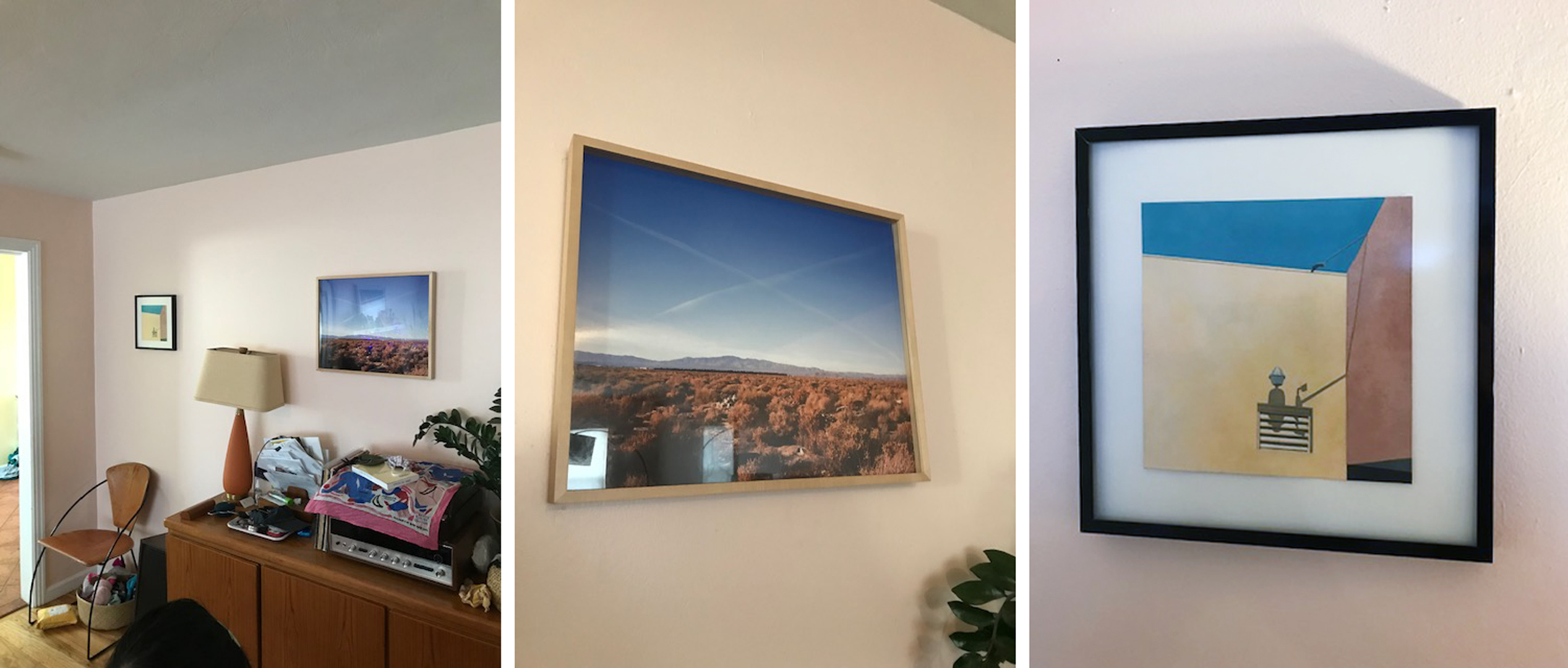
2. Gabie Strong taught me about the mystical aspect of militarism and technology, the cultish iconography involved in going to the desert to learn how to blow things up and then going abroad to kill. I find this photograph almost unbearable to look at, but it hangs in our living room as a reminder of how blank the empire really is. Gabie let me use this photograph as the cover for my second book, The Weeds, which was really written alongside her art and her thinking, her ironies and fury. I love the drama of this picture, the simple, perfect gesture – two contrails cross out god, punker style. It’s called Untitled (Mystic Truth). I find it pretty agonizing. It’s bright, but it has the boredom of the contrail, which, a thing that maybe used to provoke wonder, but has become one just more depressing sign of mastery against an abiding blue emptiness.
3. This one is a pochoir by Elizabeth Ferrell. It reminds me of many apartment carports I have known. I love the rigor and the pitiless sky. And I love the shadow falling from a lamp onto a vent. It’s nice to look at a picture that examines corners, and nice to look at a place rendered very brightly, especially if it’s a place you’re not supposed to look at. Annie Dillard writes about the horror of too much light. This one has a lot of light – the colors are benign but the brightness is terrifying. It feels like July.
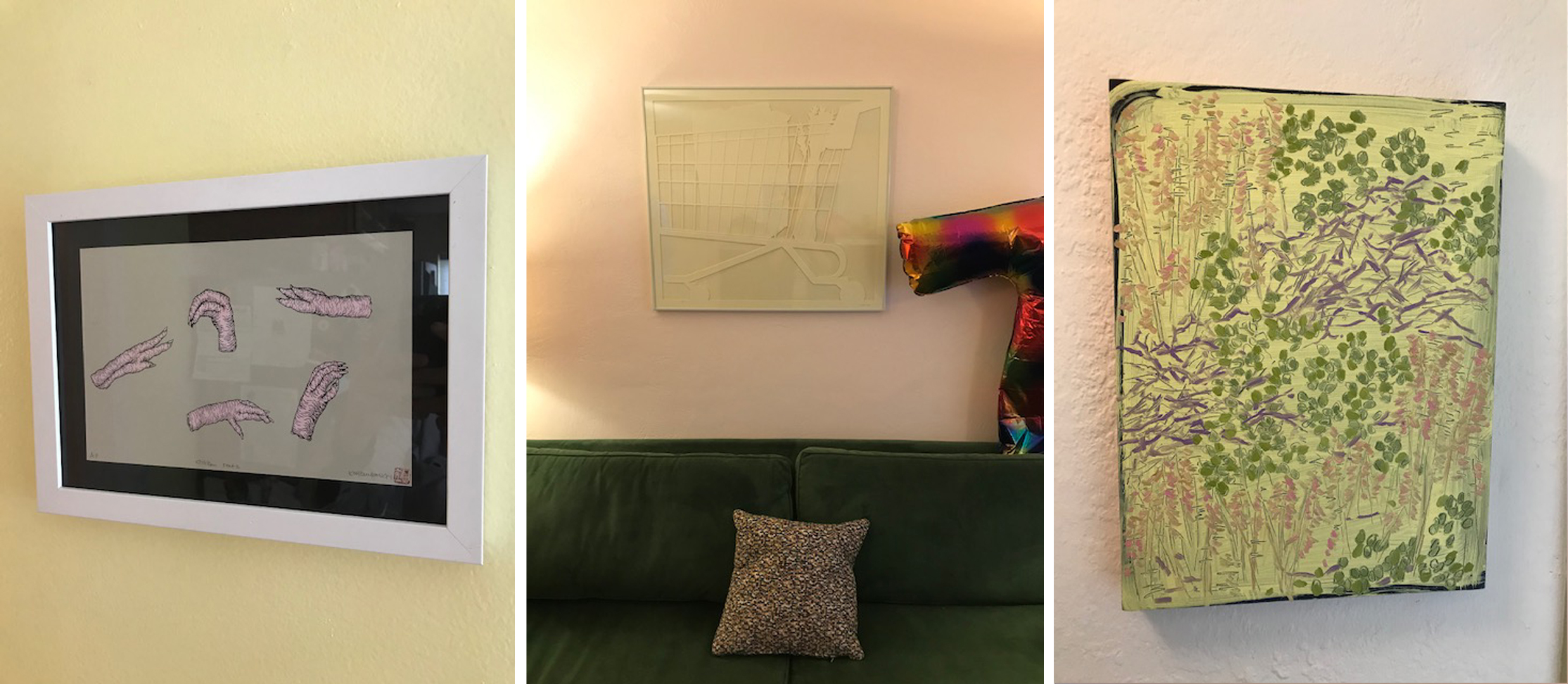
4. A couple years ago Eunkang Koh was buying chicken feet and drawing them, and she made a few prints of these drawings. We’ve always been attracted to Eunkang’s bent vision, her interest in metamorphosis, hybrids, and in-betweenness. I love how Eunkang renders the humanity of animals and vice versa. This print is almost a study of hands, but, you know, chicken feet. Of course, they’re monstrous, and the pinkness is very lurid. But they also look really tender, too. One of them looks like a hand plucking grapes. Another looks curled and dead.
5. This big shopping cart paper cut hangs over the couch, the color of which my daughter describes a “a big, pictureless dollar bill.” Aaryn found this thing for us at a garage sale, and she thought we’d like it. Isn’t there something tender about shopping carts? We like to have this kind of rigor in our living room. I don’t know if you can see it, but there’s a very detailed celery stalk, propped up in the shopping cart. It’s so perfect and abstract and ridiculous. Celery never looks like that, dude! Platonic celery. That’s the kind of technique I love, severe and monochromatic, but outrageous and excessive. All this attention for a shopping cart. Dear me! I kind of imagine
it, soon after this moment, being abandoned in the apartment carport in Ferell’s painting.
6. The color in Julia Schwadron’s paintings is hot and electric. And I just love how much they delight in the surface and the play of texture. Delight in the rigorous sense, you know what I mean? This painting’s rendering of a tangle (maybe a manzanita?) isn’t about reordering (well, the color is…) it’s in that play of depth and crosscut angles. There’s a joyousness to this painting, don’t you think? That yellow background really sends a tingle up my spine, and the brushwork is swift and intense. Don’t you love it when a painter points a sophisticated eye at sticks, twigs, bushes, things on the ground?